Seeing the Light at the End of the Dark Mode Tunnel
August 18, 2023
Conor Christie

For decades, light mode was all that was available, offering us a bright and clean background to read off our phones. Now, with one simple press of a button, the white background transforms into a black screen, allowing us to scroll endlessly without eye strain. However, behind this seemingly effortless switch lies an intricate design process. Every individual interface element – including backgrounds, text, icons, and borders – must be designed to ensure optimal visibility on both light and dark modes.
In our venture to incorporate dark mode for the Federated Co-operatives Limited (Co-op) app, what began as a project-specific task quickly evolved into the development of a comprehensive system of strategies and workflows that could be seamlessly applied to any future project.
Curious to learn how we did this? Read below about our journey down the rabbit hole that is Dark Mode.
Understanding Dark Mode
Creating a dark mode system doesn’t just involve inverting all colours of a light mode theme and calling it a day. There is a lot of nuance around how the human eye perceives colour, as well as principles that apply to light colours that breakdown when applied to dark colours. Dark mode also helps some users who struggle to view lighter colours. Since mobile operating systems like iOS and Android have made huge steps in making it easier to develop for, we knew it was the right time to try to implement a multi-themed app experience.
Creating Colour Palettes
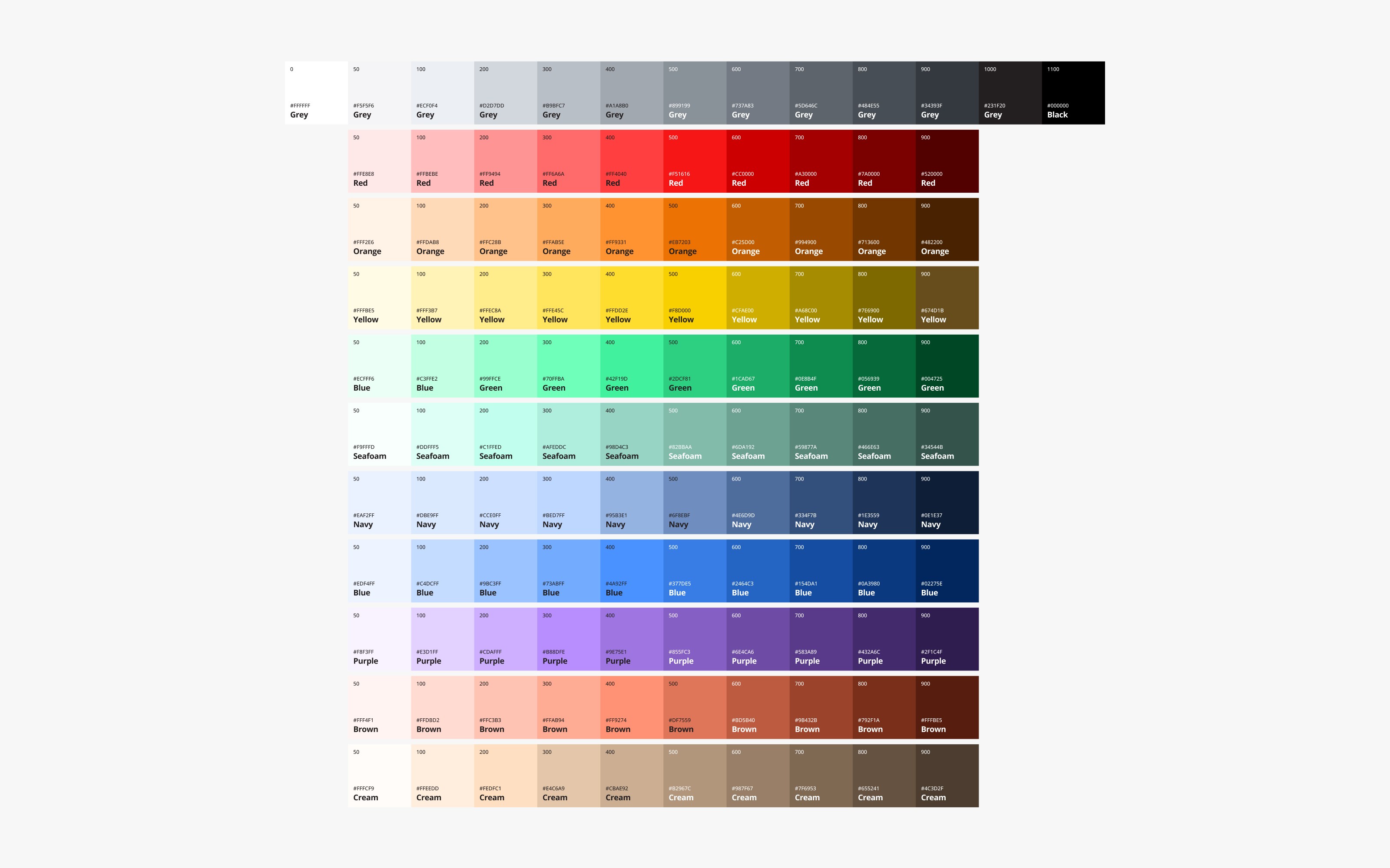
When creating a product for a company, designers are often provided with a fairly limited palette consisting of the company’s signature colours. We knew that we would need a much larger pool of colours to choose from to create the app’s individual components. In this post we’ll be using the work we did on Co-op’s mobile app as an example, but this process applies to most companies developing digital products.
For instance, the bright and striking shade of red that defines Co-op’s brand, accompanied by their supporting and complementary colours, offered a great starting point to start extrapolating a larger palette. The palette was generated by taking the base colours provided by the brand team and adding or subtracting lightness from colours. For this process we used colours based in an HSL (Hue, Saturation, Lightness) format which allowed us to quickly change the lightness value and generate colours.
At the end of the process, we had built out a palette that represented all of Co-op’s commodities, lines of business, and a few general interface colour needs such as neutral greys. This base palette ended up containing 113 individual colours.
For most colours, we set out to define 10 variants of lightness in order to create an extensive palette to work with. The exception to this rule was grey sub-palette where we defined 13 variants to make sure that there would always be an appropriate colour to choose from when designing the interface.
Organisation
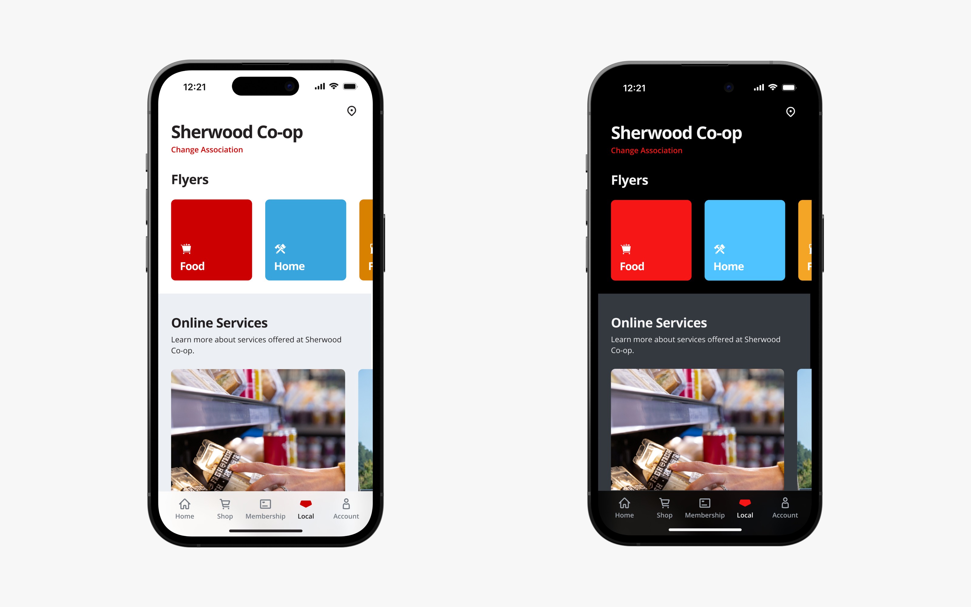
Once our base palette was defined we began to create three sub-palettes to help define our colour roles while we were building the app and its components. The three sub-palettes are called global colours and include static, light, and dark groupings.
The static colour palette was created to represent elements that wouldn’t change whether they were in light mode or dark mode. For example, the Co-op logo always appears as white and we didn’t want it to switch to black when the app appearance changed.
The other two sub-palettes are Light and Dark. You could create an infinite number of sub-palettes at this stage if you wanted to have multiple themes but for our use case we stuck with Light and Dark. These two palettes are basically mirrors of each other in terms of colour but maintain the same contrast levels as their counterpart. This means that the darkest grey colour in our Light palette will directly correspond to the lightest grey colour in the Dark palette.
Experimentation
Extensive testing was crucial in achieving a consistent dark mode experience. The best way to test our defined colour palettes was to start building components. We did visual tests to see how icons and text appear against a new background and adjusted the contrast accordingly. There was a lot of fine-tuning during this stage of the design process.
Designing Tokens
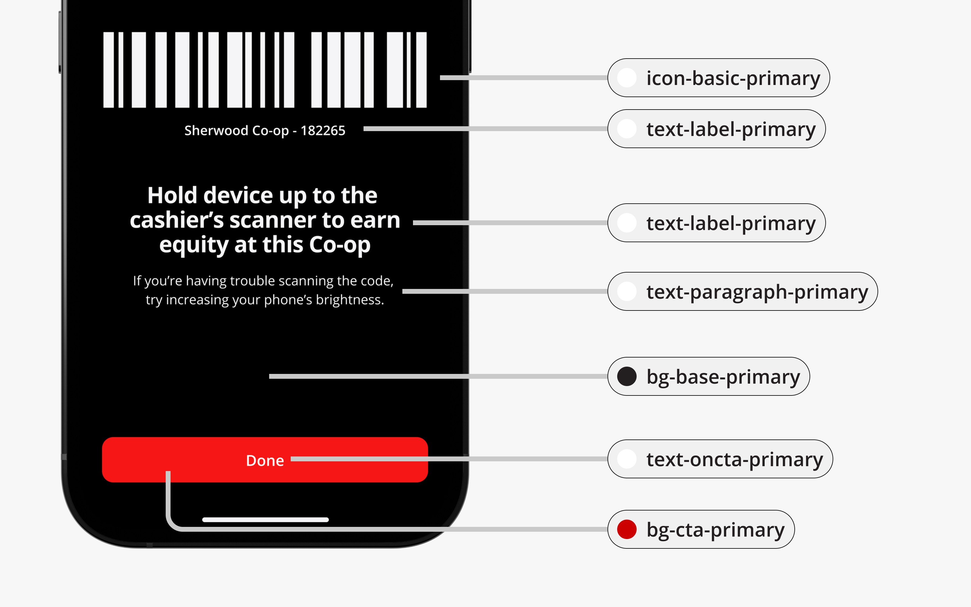
As we began to create patterns and find colours that were working well in both light and dark mode, we started to define colour tokens. A colour token is a colour value that has been assigned to a specific interface element (the background colour of a pressed primary action button). These help the designers and developers speak a similar language to ensure consistency and helps reduce manual work when changes are needed down the road. Another benefit of this structure is that if at any point someone said that they weren’t happy with an individual colour on an element, we could just adjust that token instead of affecting every instance of that colour in every interface element in the app.
There are numerous ways you could set up your token structure – but we found a basic structure that seemed to work for us. We separated our tokens into both light and dark themes with four categories within each of the themes. These categories included background, text, icon, and border.
Each category is unique in that it has different uses within a user interface. Within our background tokens we had many different interface elements that needed a background colour. Elements like buttons, switches, text inputs, and the tab bar all had unique background colour tokens.
Encapsulated in a colour token is a unique name and colour value. The naming convention for our tokens followed the structure of type, role, prominence, and interaction. For example, the Primary Button component used throughout the app had three unique background colour tokens assigned for different interaction states. In practice, the Primary Button had a background token, text token, and icon token just in its default state.
Tweaking & Development
Developers must adhere to accessibility standards when designing content, especially when working with colours or visual stimuli such as what you would find in dark mode. The content must be perceivable, operable, understandable, and robust. Meaning it must be readable, clear, and visually accessible to all users. While there can be strict procedures to follow, it’s an iterative process. Experimentation, trial and error, and tweaking features are tools we use to continually fine-tune our designs.
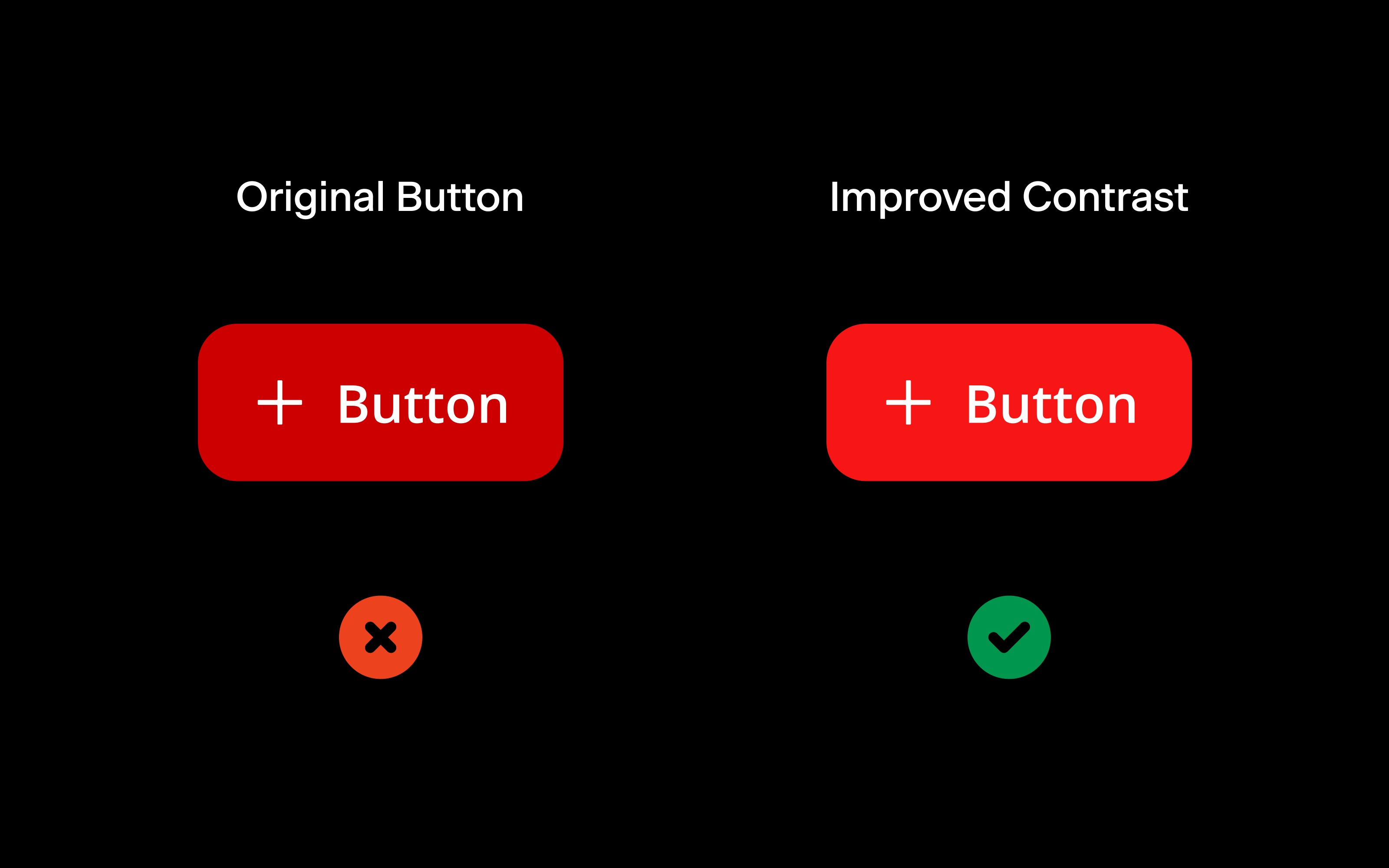
Throughout this process we had been making manual adjustments to our colour system to make sure that we delivered a consistent experience in both colour modes. One of the best and most obvious examples of this is within the Primary Button component.
At the start of the process, we actually had designed the Primary Button in dark mode to be darker than the light mode version. Our hypothesis at the time was that since dark mode is built for viewing in darker settings, we would want that button to match that. We noticed however that this button was extremely hard to see and differentiate from the background. We shifted the background colour of this button to be two shades lighter to improve contrast from the background.
Conclusion
Our goal for our implementation of Dark Mode within the Co-op app was to create a user-experience that felt modern, well-crafted, and accessible for all of Co-op’s customers. The process began by creating a large palette of colours that were then refined as we removed abstraction, allowing for quick updates and tweaks as the product came together. We then tested our palette in mockups and prototypes to make sure that our designs held up in both colour themes.
Check out our implementation of Dark Mode in the recently launched Co-op Mobile App available on the Apple App Store and the Google Play Store.